P.volve is a health and fitness company offering a streaming service, physical goods and an in-person studio. I joined the team in 2020 when the company was nearing its third birthday and took on the overhaul of the streaming and e-commerce experiences. This case study will focus on the new user streaming experience, in other words, the experience a user would have post- conversion. This project aimed to increase the value of the product and retention by:
- Providing focus. Ensuring information architecture and visual hierarchy clearly leads users to their next best action
- Educating. Providing the user the foundational knowledge they need to make the most out of the P.volve method
- Personalizing. Meeting the user where they were in their journey and serving only relevant content for that point in time
- Giving recognition. Congratulating users on their accomplishments
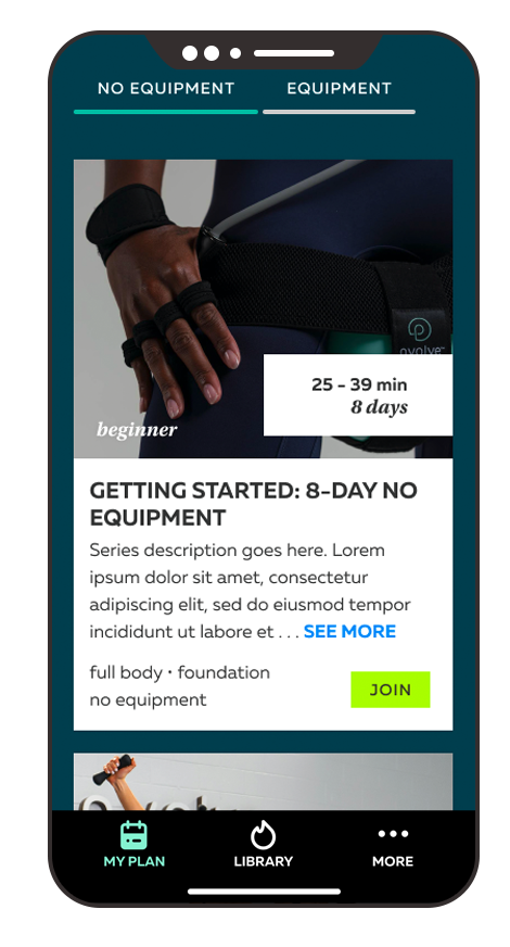
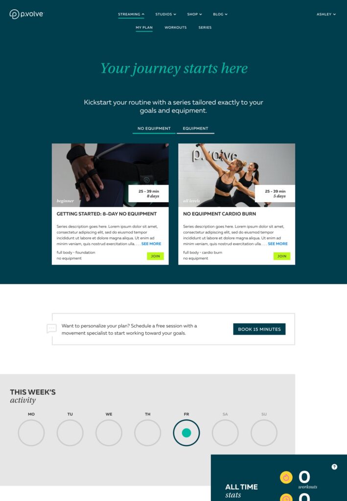
Sneak peek of the final home page design for a new user


Year
2020
My Role
Design Director
User Research
User Interviews
Journey Mapping
Sketching
Wireframing
Screen Flows
Interaction Design
Visual Design
Platforms
iOS
Android
web
The Situation
Existing Challenges
The P.volve learning curve. The moves associated with P.volve’s functional fitness method truly were unique. Learning correct form was paramount and required specific foundational instruction. Without this, not only would users not see results; they also increased their risk of injury.
Shipping time. Roughly half of users started their membership by purchasing P.volve equipment. The majority of content relied on that proprietary equipment, meaning a user’s streaming experience was limited while they waited for their equipment to arrive.
A hard deadline. The new streaming experience needed to be live for Black Friday. This gave us a little over 4 months.
A dearth of analytics. The company that was formerly responsible for the streaming experience had hardly any tracking in place.
New team, new processes. The streaming experience was formerly completely outsourced. Bringing it in-house meant the creation of the new product and design teams and a new way of working for the company as a whole.
What We Knew
Key demographics. The core P.volve demographic at the time was female, aged 30-45. The “new mom” was a key archetype. Secondarily, people who had been overworked and injured by traditional, more intense fitness offerings often turned to P.volve’s low impact method.
Series get results. While somewhat anecdotal, we had a great deal of existing user feedback that said following a structured workout program (or “series” as they were called) lead to greater results and user satisfaction.
Research
Our research strategy had three phases:
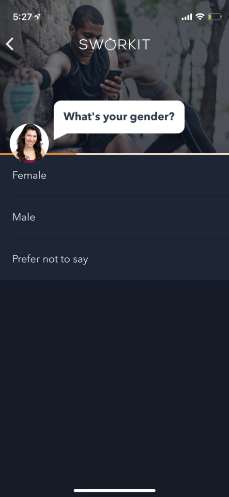
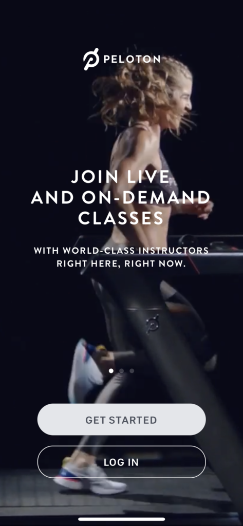
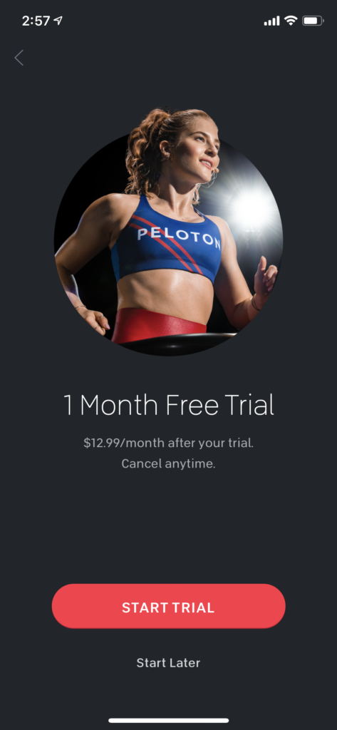
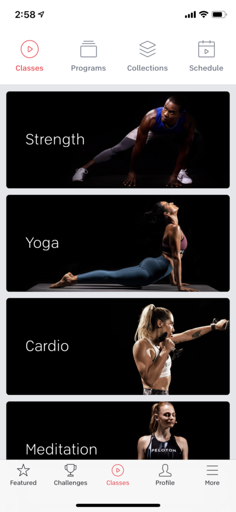
- Competitive analyses. We focused largely on apps that appealed to a similar demographic, namely Alo, FitOn, Nike Training Club, Peloton, Sworkit and Zova.
- Current member feedback. This feedback came from multiple channels including a third party research firm, AskNicely, social media, and feedback submitted directly to trainers.
- User testing. Using validately.com we completed baseline usability tests on the current streaming experience as well as tests on design prototypes later in the redesign process.
Competitive Research Findings
Onboarding experiences generally fell into 2 camps:
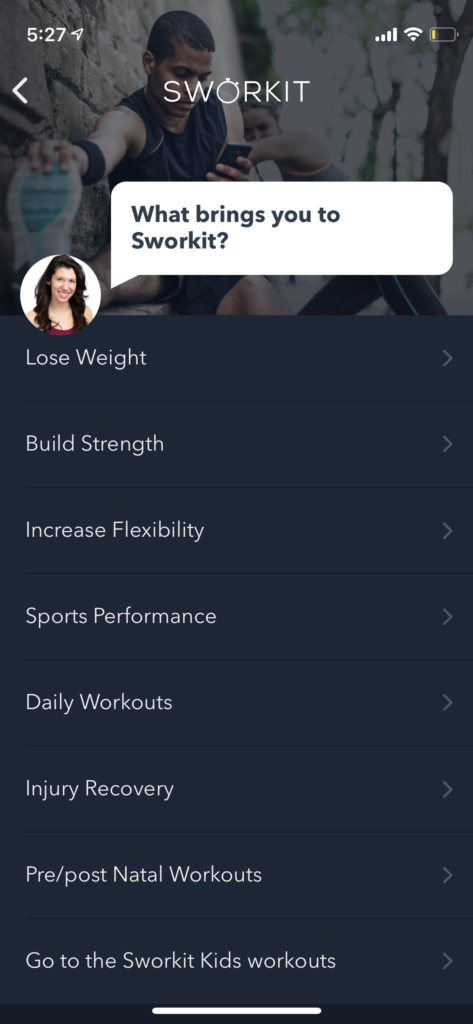
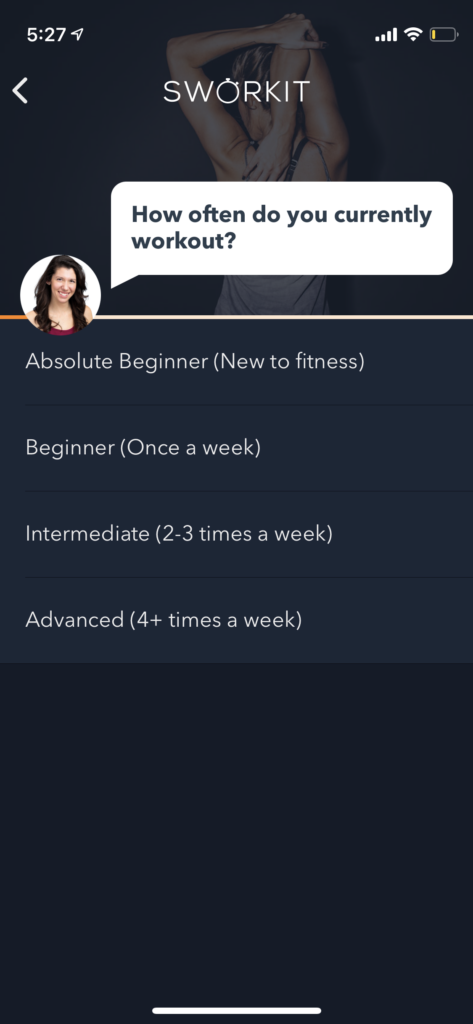
Prescriptive but labor intensive. The user answers a series of questions around things like fitness goals, preferred workout length, etc. and is then suggested a personalized fitness plan.
Pre-paywall quizzes had not worked well for us in the past, but more importantly, we wouldn’t have a suggestion engine in place by launch.
Instant access, minimal direction. The user is immediately dropped on a library or home page and must decide their next action.
Luckily, our learning curve meant we had a common starting point for the vast majority of users.
Member Feedback Findings
and designing for a new team
This was one of the first projects taken on as a new, cross-functional team. There were understandable uncertainties around responsibilities and division of labor. To help ease those uncertainties we created our first user journeys with an emphasis on departmental touchpoints. These feedback-informed artifacts helped facilitate cross-functional conversations.
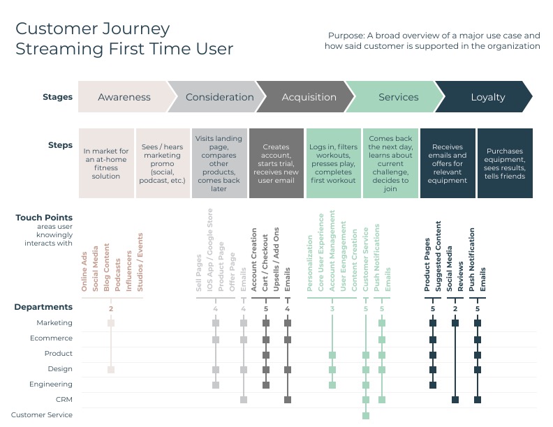
Just one of the journey maps distilled from user feedback. The valleys in the journey gave clear areas for improvement.
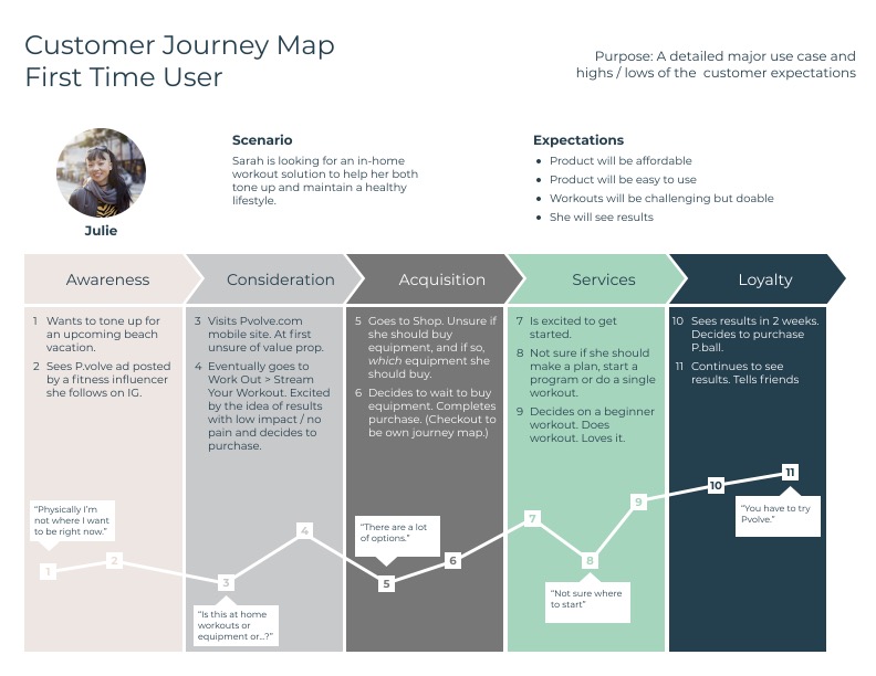
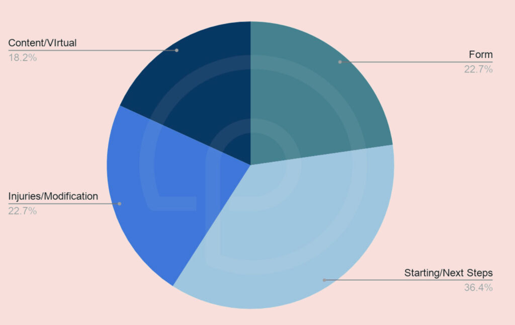
Member feedback also confirmed users commonly had questions on form. Clearly they were not getting the necessary foundational knowledge.
Baseline User Testing Findings
Unmoderated Validately tests on the existing onboarding experience confirmed what we were hearing from current members: no one knew where to start. They were overwhelmed with options.
In Summary
The new onboarding experience would need to:
- Prioritize the foundation tutorials
- Give clear next steps and minimize distractions
- Take into account most users will not yet have their equipment
- Encourage users to start a series
Designing: Phase 1
With product, design and engineering alignment, we moved into wires.
Initial Desktop Wires
70-some% of our streaming traffic was on desktop, so we took a desktop-first approach to wires.
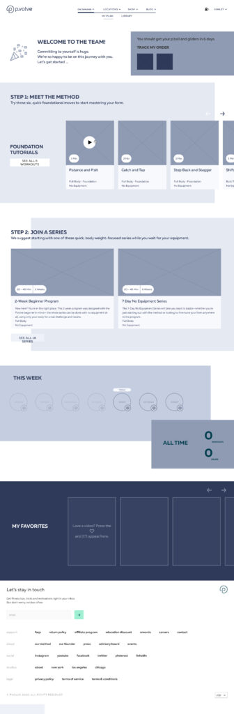

These featured:
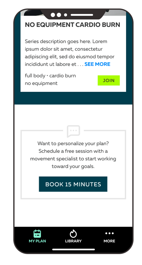
- Congratulatory messaging
- Integrated order tracking module
- 2 Step ramp into a short, no-equipment series, starting with foundation tutorials while members wait for their equipment
- Equipment education content once delivery was complete
Other features on the page, though not strictly considered onboarding:
- Workout tracking
- Favorites module
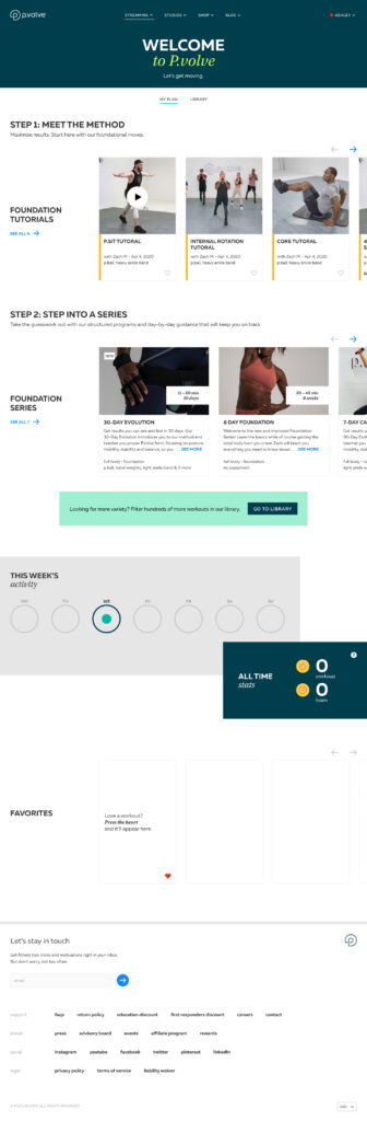
Refinement and Visual Design
We continued to experiment with completion states, both for individual workouts and entire series.
Integrating with our delivery partners for order tracking proved to be a surprisingly high LOE. We punted on the equipment modules to keep with our timeline and launched Phase 1.
Phase 1 User Testing Findings
To measure our success (and understand what we got wrong) we conducted Zoom interviews with current members and unmoderated user tests via Validately.
What resonated:
- Completion states gave a sense of accomplishment and satisfaction
- Far less confusion around where to start
What didn’t:
- Multiple steps created unnecessary cognitive load. Users simply wanted to get in there and start working out.
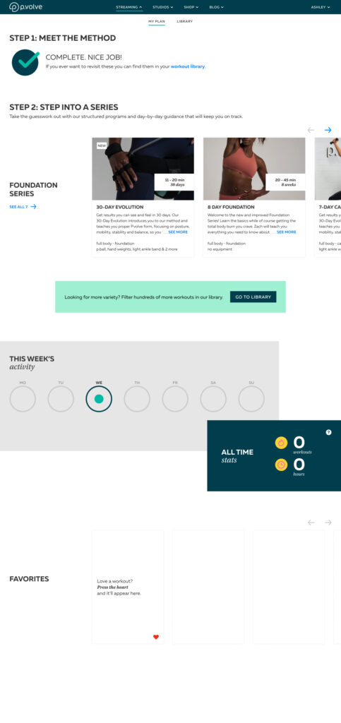
Designing: Phase 2
After a bit more experimentation and a few more feedback rounds, we settled on reshooting the most popular beginner series to include the tutorial content. This condensed the 2 steps into 1 and allowed users to start with an actual works instead of a tutorial.
We also drastically reduced the number of suggested series to reduce decision fatigue.
The Results
The launch of phase 1, while unfortunately riddled with bugs in early days, still improved our DAU/MAU ratio from the low teens to low twenties. Additional content releases and player improvements increased that further into the mid 20s.
I left the company before the launch of phase 2. However before my departure my team began concepting on pre and post paywall “quizzes” and other forms of onboarding and personalization. I’ll leave you with a Figma link to our work below.